I’ve had great luck in finding wonderful design teams to work with.
Give a user a boost
The problem
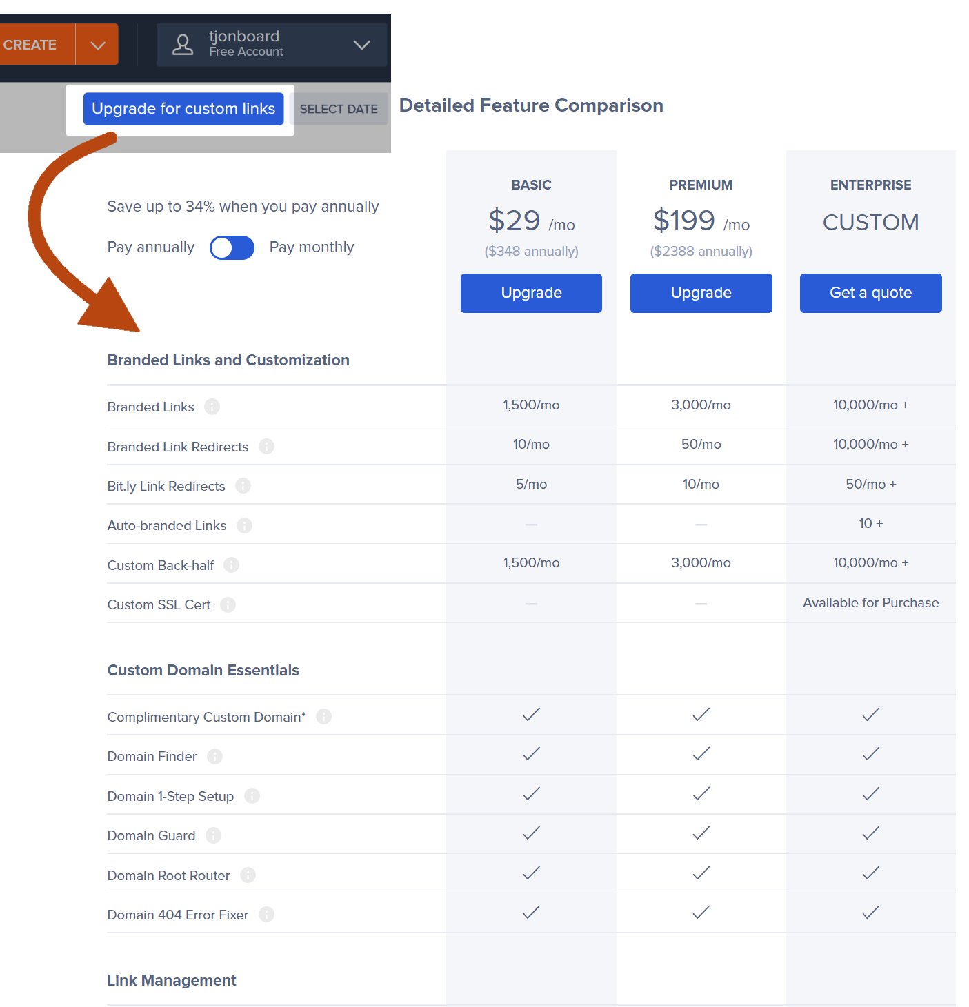
Bitly’s upgrade path started with a jump from an in-app CTA to a pricing page with a whole lot of information to process.
The intent was to tease a feature and entice the user to explore our subscription plans, but users were dropping off rather than upgrading.
I suspected this jarring leap was at the heart of the issue.
The experiment
Our Growth team had run experiments to increase upgrades, like improving the checkout flow, but they weren’t moving the needle. I encouraged the team to look at this from a storytelling perspective.
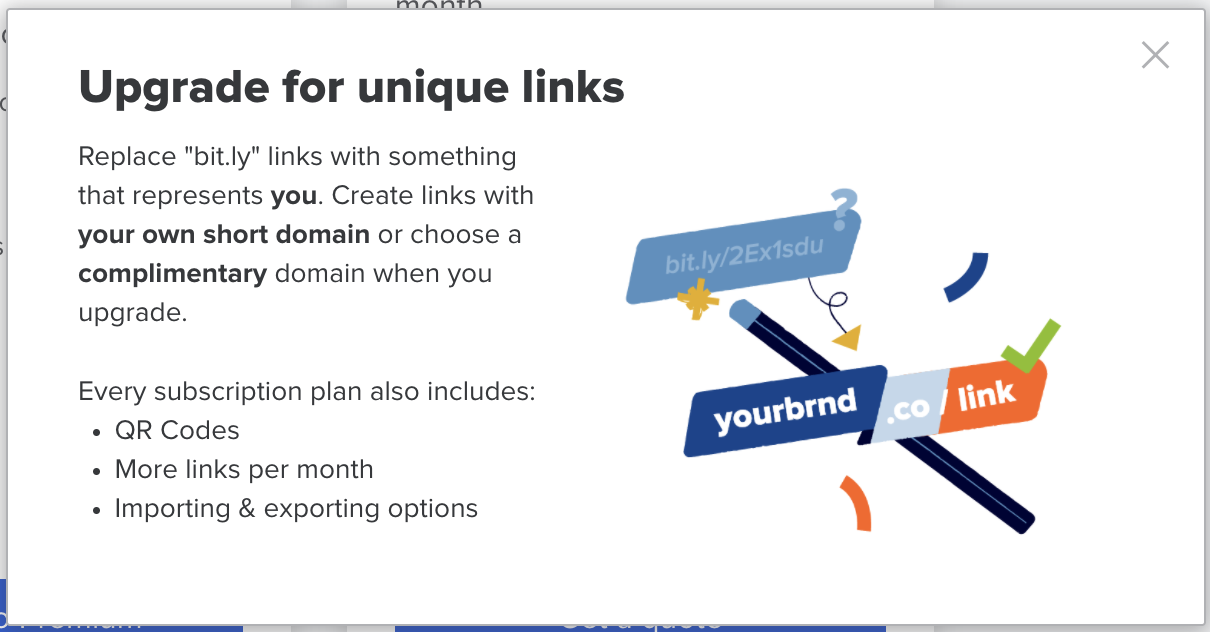
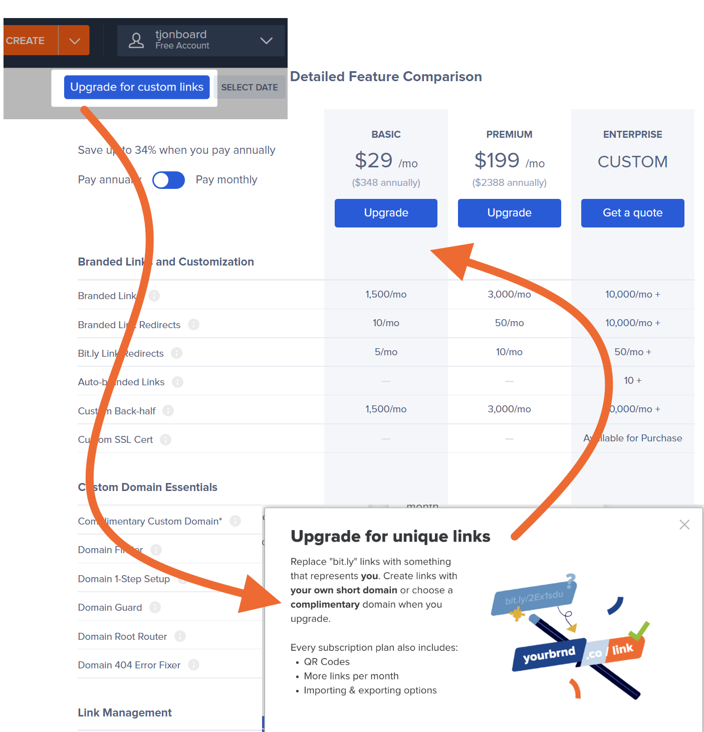
I worked with our designers to create a simple “booster message” to reflect the user’s intent, tell the story of the feature, and explain its connection to the plans.
Using a tool called Pendo, we were able to quickly experiment and iterate on the design.
The results
By accompanying the user on their journey and providing guidance along that path, we saw a significant increase in upgrades.
Our conversion rate from subscriptions to pricing page views increased from 1.91% to 2.89%. This equated to a daily average MRR jump from $1,514 to $2,040.
We are now experimenting with boosters across assets that contain a CTA, from in-app prompts to email to ads.
Confirming a subscription downgrade
The original
When a customer downgraded their subscription, the page hit them with scattered information and three CTA’s.
The cognitive load was burdensome. The messaging was aggressive.
We knew customers were having trouble understanding the impact of choosing a lower plan level, and their inquiries mirrored the tone of this page.
The new
With fewer distractions and a succinct, scannable list, we were able to make the content easier to process. The point was to help someone make a more informed decision.
We highlighted the item that prompted the most common question. This reduced the number of related support tickets… and account downgrades.
Filling the empty state with a welcoming one
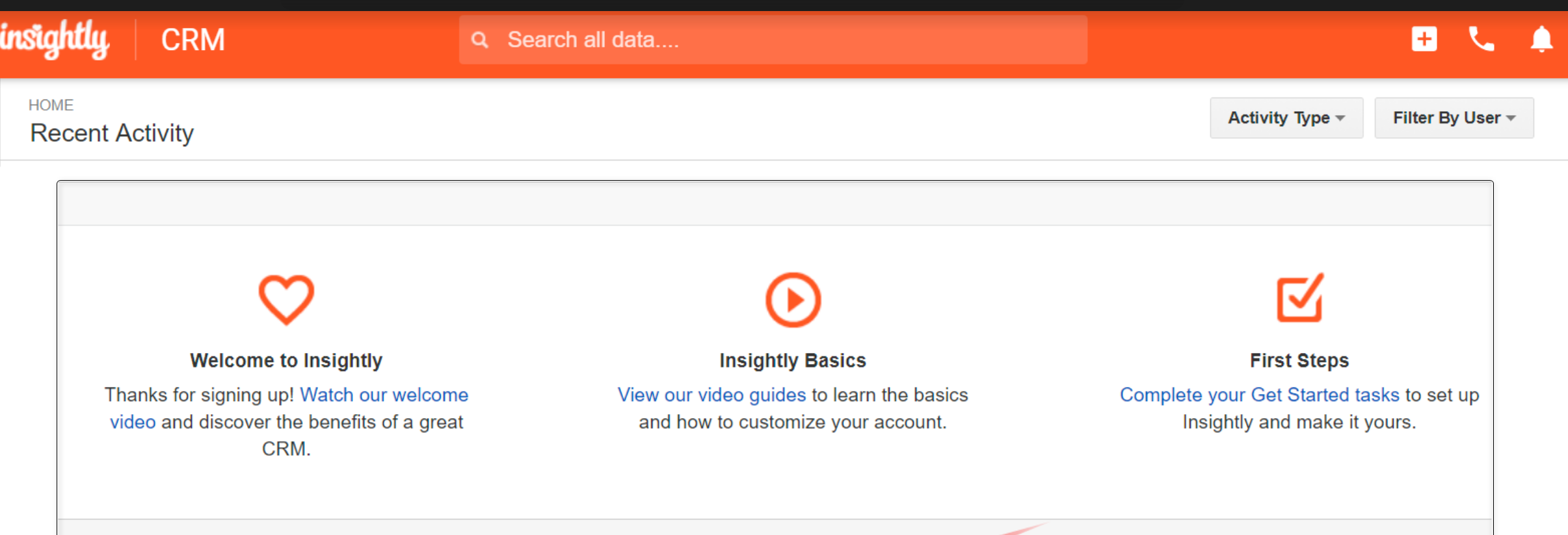
Insightly’s new users were faced with an empty page after registering. Many of them didn’t know where to start.
Using Pendo, a tool for in-app messaging and analytics, we tested options for a new welcome experience until we found the copy and illustrations that prompted the most interactions.
The welcome modal gave customers choices, allowing each person to follow their own path. Customers who interacted with the options had higher retention rates.


